
July 26, 2010 -- For librarians and archivists, choosing among myriad metadata standards for digital content can be an overwhelming task. "I spend a lot of time talking to people about how to select metadata standards," said Jenn Riley, metadata librarian in the Indiana University Digital Library Program. "My job at Indiana is to figure out how to represent the information we need to describe our digital library resources, and to pick the metadata standards that fit those needs."

Jenn Riley. Credit: Courtesy of Jenn Riley
Riley offers her Visualization of the Metadata Universe (external link) infographic as a tool to help put the immense list of metadata standards into a more orderly and contextualized setting.
Riley, who has worked in Indiana's Digital Library for ten years, selected 105 different standards and rated them on a scale of how frequently they were used across four different axes: community, domain, function, and purpose. Riley described this process as organic. "I tried to make some hard-and-fast definitions about what is strong, what is weak, but across the different axes that’s difficult to do. I hate to say it, but categorization was based a lot on feeling, and my experience on what’s most relevant to different areas."
The resulting image shows two ovals with the standards radiating outwards and sorted into color-coded categories. Planners can easily consult the graphic to see which metadata standards are most frequently used with particular types of data or for particular functions. Riley said that she had originally planned on incorporating the metadata glossary terms into the visual itself, but that "once we started working on it, we realized that just wasn't going to work." The glossary is instead available separately (external link) (PDF).
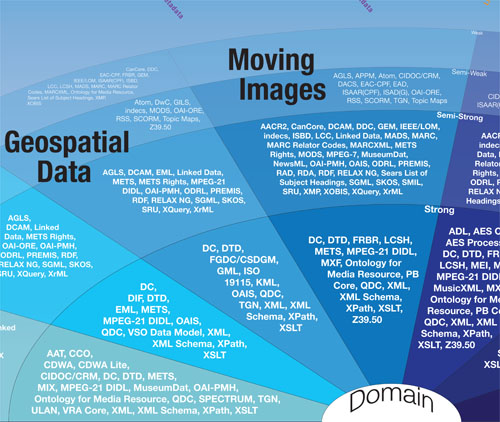
Visualization of the Metadata Universe. Credit: © Jenn Riley 2009-2010
Riley said she had had the idea for the visualization for a few years, and then when she got a professional development grant from the Indiana University Libraries in 2008, she decided to use the funding to hire a designer and bring the idea to fruition. The design for the graphic is by Devin Becker, a student at the Indiana University School of Information and Library Science. Said Riley, "I got a whole lot of feedback just on the visual nature of it and how beautiful it is, and I can take no credit for that at all—that's all the designer."
When asked how much feedback she'd gotten about the graphic, Riley laughed. "Tons!" She had expected people might be critical of the map and her categorizations for the metadata standards, but found the general reaction to be quite positive. "I'm not trying to prescribe things here with these categories," she added, acknowledging that she expected some people would have different opinions about which standards belonged where on the map.
Riley has no immediate plans for other types of infographics, but would like to update the map periodically. "For example," she explained, "there are more standards that could be added. It would be nice to update it, and these standards do change over time. I mean, I could tweak this every day if I had time to."